1. Make your website user friendly
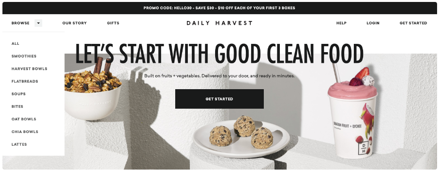
When it comes to e-commerce sites, user-friendliness is a must. Customers must be able to easily browse your website to make purchases. For example, take the Daily Harvest website as an example. The homepage clearly explains the purpose of products, and the “Getting Started” CTA is a quick link to explore purchases:
There is also a drop-down menu on the homepage, so customers can easily navigate to what they are looking for. Drop-down menus can keep the website organized and reduce the busyness of the homepage.
There is also a drop-down menu on the homepage, so customers can easily navigate to what they are looking for. Drop-down menus can keep the website organized and reduce the busyness of the homepage.
2. Ensure a secure checkout process
If you can shop on your website, make sure your customers know that their credit card information is safe. You can do this in two ways. First, as shown on the beauty company Billie website, you can include it in the “info” button:
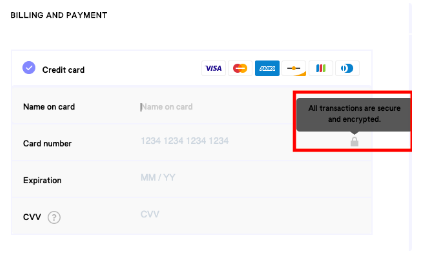
If you want to display secure checkout information, but want to avoid crowded checkout pages, the info button is very useful. However, if you want to explain checkout security more clearly on your website, such as in the paragraph at the top of the “Place an order” page, this may be helpful to website visitors who make careful purchases online.
3. Add filtering options for your product
As a consumer, I like filtering options, which can help me find products or services easily. This is why they are essential for your e-commerce website: customers who know exactly what they want can find it without having to filter through too many options. Take this filter list in “Small Market” as an example:
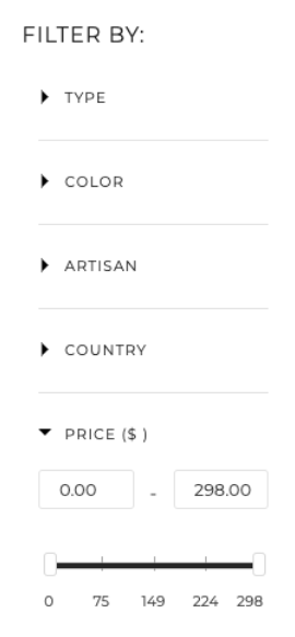
There are many pages on the Fair Trade Home Decoration website, so this particular filtering system can help consumers find what they want based on multiple categories. When designing a filtration system, make sure that the categories are broad enough to fit all products, but specific enough to be helpful to customers. For example, a record company’s website that sells merchandise may provide filtering options based on artist, genre, or record company’s clothing.
4. Integrate social media on your product pages
Social media icons on your e-commerce website? Absolutely. Social media buttons can increase brand awareness. For example, if I want to share the following printout on my Twitter account, these buttons can make it easy for my followers to click the link when they are interested in learning more:
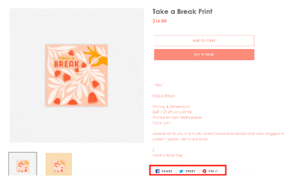
Social media sharing options give shoppers the opportunity to share your products with their circle of friends and family, so you can reach a wider audience. For more information on social media marketing, check out this final guide.
5. Make your website responsive for mobile devices
More and more consumers are making purchases through smartphones nowadays. So having a website optimized for mobile phone screens can make customers’ purchases easy and enjoyable. For example, let’s look at Dollop CoffeeCo, a coffee retailer based in Chicago. This is the “Shopping” tab on the desktop:
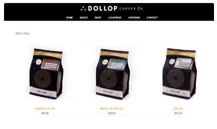
Products are clearly labeled, the photos are large and clear enough for desktop browsers to see, and the navigation is easy to understand. In contrast, let’s take a look at the same tags on mobile devices:
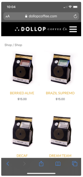
Note that in the mobile responsive design, the photos are smaller and the four products are displayed in a different format from the desktop version. These small changes make navigation on mobile devices as easy as on the desktop. Now that you have mastered some excellent e-commerce website design skills, let us look at how some of these practices can be combined with some excellent e-commerce website design examples.


